News - Branding
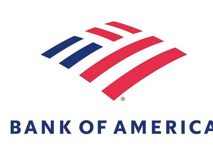
Bank of America tweaks its 20-year-old logo
November 30, 2018

The new logo has a more modern look to it but does not stray from the iconic Flagscape design. It features cleaner lines with more spacing between the all-capital letters and a new typeface set in a darker blue.
Meredith Verdone, chief marketing officer at BofA, says the logo refresh is happening in tandem with a new marketing campaign newly launched, which pitches on one question: "What would you like the power to do?"
Verdone says the question captures BofA's customer-centric efforts by acknowledging customers' goals and the bank's role in getting them there. We are a modern company that’s simplifying things on their terms," she says.
The campaign is themed as “The Power to Make a Difference” during the holiday season and will highlight various organizations solving environmental and social issues. Verdone describes it all as a "holistic vision" for where BofA is going as a business. The series of spots features chief executive Brian Moynihan, fashion designer Tory Burch, actor Matt Damon, and president of the Special Olympics Tim Shriver.
Verdone stresses that the logo and marketing campaign are part of an overall strategy that repositions the brand and better reflects what a modernized company has to offer its customers today.
She says the logo change is happening at the corporate level now and will be displayed across its customer-facing services come 2019.







.jpg)

