News - Branding
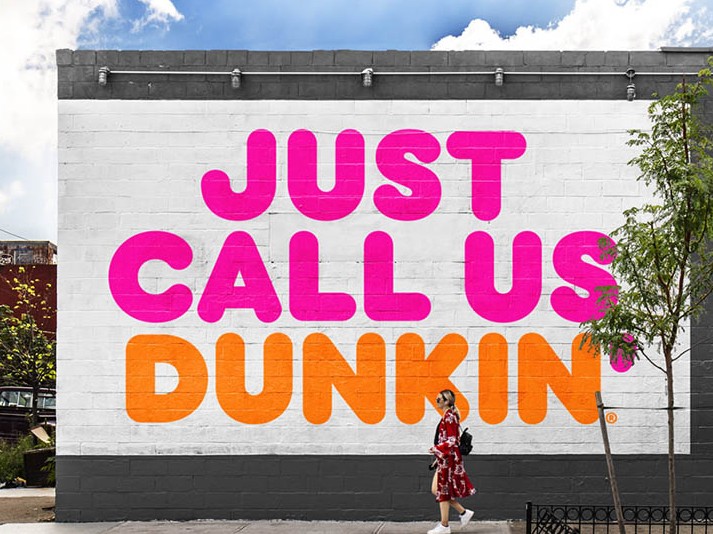
Dunkin’ Drops The ‘Donuts’ from Its Name
September 25, 2018

According to Dunkin's own press release, the choice to remove the "Donuts" comes from a long-running effort to get people into stores during the day. Within the past few years, Dunkin' Donuts has changed its drink offerings, expanded its food menu and is now trying to lose the "Donuts" to get people to think about them outside of their morning coffee stop.
With this name change, the brand will keep its familiar pink and orange colors and iconic font and the coffee is going to be the same as well. This branding is meant to convey "the company's focus on serving great coffee fast, while embracing Dunkin's heritage" by retaining its original look introduced in 1973. The company wants to reinforce itself as a "beverage-led brand and coffee leader" following the announcement of the tests that began last year. Since many of the chain's customers already refer to it simply as Dunkin', the name change will be natural reads the press statement while the rebrand, is also called "a recognition" of the affectionate relationship fans already have with the company. It remains to be seen, however, if fans will actually see the shift as organic. Regardless of how people feel about the name shortening, a new logo will appear on packaging, advertisements, social media pages, and the company's official website in January. Dunkin' signage will also be featured on the outside and inside of new and remodeled stores.






.jpg)

