News - Branding
Carlsberg Goes into a Global Rebrand
September 7, 2018

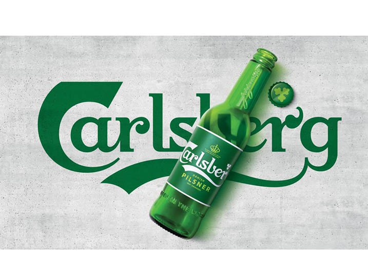
Indeed, the design has looked to ‘better’ its 171 years of history (since 1847), hence carefully re-crafting Carlsberg's core elements--the logo, hop leaf, crown, brand typeface, and signature of Carlsberg founder JC Jacobsen.
These assets combine to form a coherent-simple yet versatile- master brand-led identity system that works across packaging, promotions and POS materials for all of Carlsberg's global variants.
In doing so, the brand also hopes to reiterate the famed tagline of the beer of being ‘probably the best beer in the world’ which will also be used.
Jessica Spence, chief commercial officer at Carlsberg Group, says: "The new design system is very much anti-trend. It's designed to be permanent, or more permanent than any iteration of the design system has been before. There shouldn't be any need to change this for a good long time. That's part of the sustainable thinking that was built into the very core of the brief." Jessica Felby, design director on the project for Carlsberg, says: "Designs used to last 10 years, then five, now brands redesign every three years. It's all based on trends that go out of style. We weren't going to do that." The redesign was carried out by Bristol-based brand design agency Taxi Studio. The rejuvenated Carlsberg brand has launched in Scandinavian markets this September and will be rolled out globally over the course of 2019.





.jpg)
