News - Branding
The Medal, The Flame, Marianne
October 22, 2019

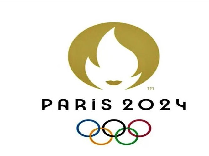
In a statement published to its website, the Olympic committee said the emblem represents the Olympic flame, a gold medal and a feminine face (Mariane). The circular design with Paris 2024 in the art deco style, which was in vogue in 1924 when Paris last hosted the Games, incorporates the lips and outline of Marianne, the personification of the French Republic since the revolution in 1789.
"The flame invites us to dream, to engage and to come up with new ways of staging the Olympic and Paralympic Games," the statement said.
The organising committee explains that Marianne “embodies the revolutionary spirit” of the Games, and, being a familiar figure to the French public, serves as a reminder that the Games “belong to the people”. "Her face is also a homage to female athletes and a nod to history, as it was in 1900 at the Olympic Games in Paris that women were first allowed to compete," continues the statement. "She encapsulates the desire to bring the competitions out of the stadium and into the heart of the city."
The rest of the identity draws inspiration from art deco and art nouveau, with an original typeface that harks to Paris’ iconic, famously art nouveau Metro signs. The typeface comes in seven weights and styles, each inspired by different archival typefaces such as Fonderie Typographique Francaise’s Excelsior (1920), Maximilien Vox Deberny-Peignot’s Banjo (1930) and John F. Cumming Dickinson’s Excelsior and Desdemona (1886). Simply called Variable, it’s designed to adapt “smoothly” on all digital media.
The identity was revealed via a film that tracked 700 runners around various routes in central Paris, who gradually revealed the form of the Marianne emblem. It was revealed in full at the Grand Rex cinema in Paris at 20:24.
Unfortunately for organisers, most people around the world saw someone entirely different and like many logos before it, the design was met with some heavy criticism.


.jpg)


