News - Branding
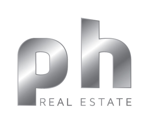
ph Real Estate marks new era of growth with new logo
June 7, 2021

ph Real Estate brokers, one of Dubai’s oldest and most well-respected real estate brokers, is approaching a raft of new business opportunities with a rebrand. The well-recognised and renowned brokerage, the name behind some record-breaking real estate deals, is refreshing its brand and its business ready for the post-pandemic era.
Established in 2008, ph Real Estate is the name behind many milestones – Dubai’s most expensive villa sale in 2017; the most expensive land sale in 2018 and the most expensive rental property in 2019 for example.
Refining the logo and brand comes after some heavyweight investment in the Dubai-headquartered company, which is now planning to move away from its runaway success over the last 13 years in the residential sector, by also moving into commercial, hospitality and tourism sectors.
Nick Grassick, company Managing Director, says: “This brand refresh is the first step in creating a brokerage that, while remaining a trusted local expert, will also begin looking into new sectors and markets. This is a truly monumental move for us, and the whole team is excited by what the future holds for ph Real Estate.”
Grassick adds that refining the logo and colour schemes is a key part of the evolution of the company and the brand: “The last time we overhauled the logo was six or seven years ago, when we rebranded from PowerHouse Properties to PH Real Estate - and now to ph Real Estate.”
The company is putting final plans in place for a number of new divisions, including the first sub-brand, ‘The Collection by ph’, a special purpose vehicle which enables ph Real Estate to present boutique or unique developments outside of its normal remit of residential homes.
Part of the company’s development includes appointing a new marketing manager Fiona Rock, who says: “While we didn’t want to dramatically change the logo - we’ve been part of the Dubai property landscape for a little over 12 years - we did feel a simplified logo with a more classic colour palette better suits the markets and sectors we are expanding into.
“The company ethos has always been to strive to be the best, not the biggest; quality over quantity. We now have a renewed vigor to expand further into the luxury sector, but no longer confined to simply residential. We’re currently eyeing opportunities across the commercial, hospitality and tourism sectors.”
So what’s new? The brand lettering, ph, is now lower case, and the bold, bright new look is designed to symbolise luxury, class, and professionalism. Black represents elegance, certainty and authority, while silver signifies strength.
The complete rebrand of the business and the launch was entirely created in-house, with the direction of the brand new, highly talented marketing team.




.jpg)
