News - Branding
Mastercard Tweaks Its Brand Mark to Adapt to a Digital Environment
January 7, 2019

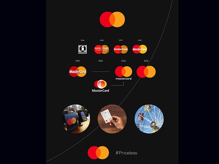
The interlocking red and yellow circles, referred to as the Mastercard Symbol, will now stand on its own across cards using the red and yellow brand mark, acceptance marks at retail locations both in the physical and digital worlds, and major sponsorship properties. As the consumer and commerce landscape continues to evolve, the Mastercard Symbol represents Mastercard better than one word ever could, and the flexible modern design will allow it to work seamlessly across the digital landscape.
“Reinvention in the digital age calls for modern simplicity,” said Raja Rajamannar, chief marketing and communication officer at Mastercard. “And with more than 80 percent of people spontaneously recognizing the Mastercard Symbol without the word ‘mastercard,’ we felt ready to take this next step in our brand evolution. We are proud of our rich brand heritage and are excited to see the iconic circles standing on their own.”
The red and yellow interlocking circles have been the hallmark of the Mastercard brand for more than 50 years, symbolizing the brand’s promise to connect people to Priceless possibilities. The instantaneously recognizable circles are a powerful symbol that bring people closer to their passions and give them the confidence and trust that their transactions are secure.
“We live in a time where, increasingly, we communicate not through words but through icons and symbols. Mastercard has had the great fortune of being represented by two interlocking circles, one red, one yellow, since its founding in 1966, said Michael Bierut, partner at Pentagram. “Now, by allowing this symbol to shine on its own, Mastercard enters an elite cadre of brands that are represented not by name, but by symbol: an apple, a target, a swoosh. Mastercard’s two interlocking circles have always represented their commitment to connecting people. Now, that commitment is given greater presence by Mastercard’s status as a symbol brand.”







.jpg)

