News - Branding
Domaine Wardy turned 21 this year
by Ghada Azzi
February 2, 2019

Indeed Domaine Wardy decided to get closer to nature with a commitment to organic farming in its new vineyards (to be planted in 2019-2022), a respect for the environment, as it decided to switch to solar energy in the winery (solar panels to be installed in December 2018), and a new waste water treatment (scheduled for 2019). Therefore, the company wanted a logo that represents this evolution--a dynamic, nature-inspired logo.
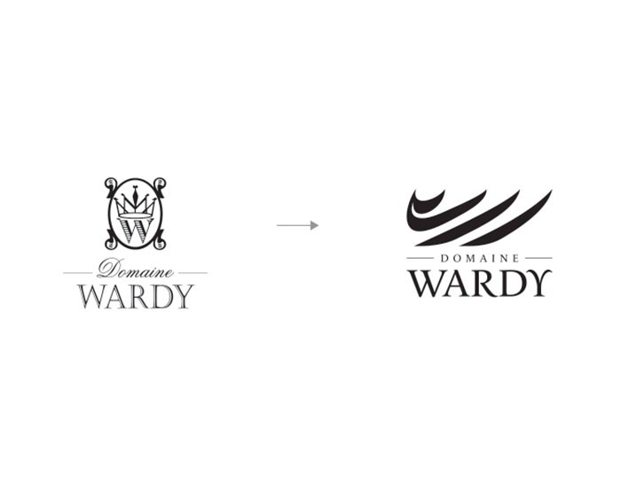
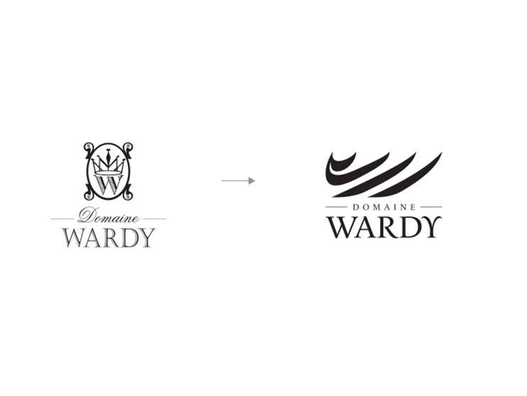
The old logo, a W wearing a crown in a frame looked old-fashioned, rigid and derivative – and no longer reflects this coming-of-age of the brand.
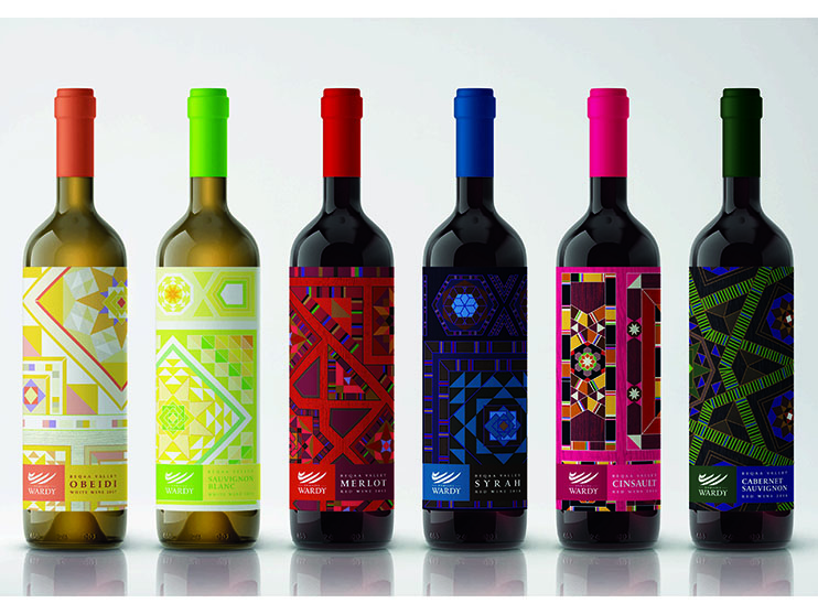
The company turned to Tarek Atrissi Design, a design studio with offices in Barcelona and the Netherlands, engaging Tarek Atrissi to create a new identity as well as design new labels and refresh the brand’s image.
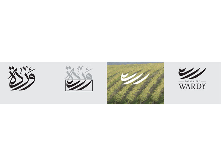
What the renowned designer came up with was ingenious. The new logo is simply the main body of “Wardy” written in Arabic calligraphy, which happens to resemble the rows of vine trellises.
It is an abstract dynamic icon, on top of an elegant wordmark set in the beautiful "le Monde Journal" typeface by typofonderie.
Far more contemporary, the new brand identity is much more memorable and practical for use in the variety of the production and packaging needs of Domaine Wardy's products.
A short animation was published on the brand's Instagram page that shows the transition from the old to the new logo.
The music chosen for the short animation comes from Leoš Janáček’s opera, 'The Cunning Little Vixen', which deals with the relationship between man and nature, an issue at the core of all wineries. The theme itself depicts dawn, the start of a new day, a new beginning.
"This is our new beginning as we take pride in our past and look to the future with joy, abandonment and a dedication to represent the Beqaa Valley terroirs in the most honest light,"asserted Khalil Wardy, General Manager, Domaine Wardy.
The new logo has rolled out on all bottles labeled after December 2018.




.jpg)

