News - Branding
Elmir's identity speaks volumes
by Ghada Azzi
February 22, 2019

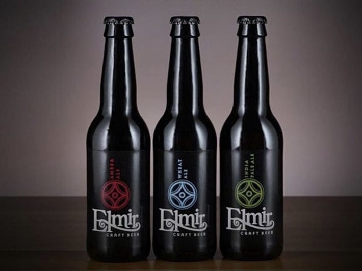
Its unusual graphic look and contemporary dark palette distinguishes this alcoholic brand from the rest of the beer category. This sophisticated branding created by boutique agency Lorem Ipsum seems to come as an inherent part of an overall strategy crafted to position the brand as ultra-premium and hip beer.
So it is no surprise to see a packaging that clearly stands out with its artsy graphic look—one designed to be worthy of a leadership status and eventually to stand apart on the bar shelf next to other alcoholic beverages.
The challenge for this new brand was obviously to move away from the notion, through design, that beer is a casual mainstream drink. What elmir is trying to convey is that beer is much more than a drink. The design needed to ensure the product is defining the brand's personality and competitive edge. The strong graphic patterns succeed in distinguishing elmir status. Black is used as the common color cleverly combined with unusual patterns in a repetitive form to bring a very modern, and original treatment to this alcoholic drink packaging.
The strong emphasis put on elmir's identity definitely steers away from mainstream ideas surrounding beer.


.jpg)


