News - Branding
Design Plus: When a logo is a no go
by Mark Tungate
February 25, 2019

Zara went through this experience recently when the agency Baron & Baron – founded by the esteemed French designer Fabien Baron – redesigned its mark.
The stakes were pretty high for Zara, which never advertises outside its store space. So those dark blue paper bags with the familiar lettering are like mini mobile billboards. The old logo, with its widely spaced serif lettering in a custom font, had become part of the urban furniture – which was perhaps the point of the redesign.
The new version, as you can see, squeezes the letters together like a train hitting buffers, while adding a couple of decorative curls to the Z and the R. Baron is a master of fancy typography, having worked his swirly magic on magazines such as Harper’s Bazaar and French Vogue, as well as the luxury brands Dior, Coach and Bottega Veneta, so presumably he knows what he’s doing.

Nevertheless, social media erupted with sarcastic responses to the logo change. One oft-quoted jibe was from designer Erik Spiekermann, who tweeted: “That is the worst piece of type I’ve seen in years. Was this done by one of those new robots that will replace humans?” Other commentators called it “cramped” and “claustrophobic.”
Logo changes often provoke mild hysteria among consumers. The primary example is that of The Gap, which in 2010 was forced to backtrack and abandon its new logo following an outcry from fans. The BBC even referred to it as a “debacle”.
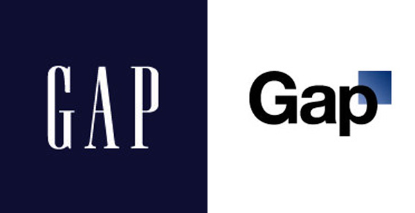
According to Advertising Age, the new logo was among several suggested by the agency Laird & Partners after “a shootout among three shops”. Bill Chandler, Gap’s spokesman, admitted the logo was “one change too many and executed too fast”. Today, Gap retains its original logo, with elegant serifs still in place.
Other fashion brands have revamped their logos recently. Burberry launched a bold sans-serif new typeface created by the British graphic design legend Peter Saville. He also came up with a monogram featuring an interlocking “TB” print – ideal for plastering over prestige baggage à la Louis Vuitton. The changes marked the arrival of Burberry’s new fashion designer, Riccardo Tisci.

The fashion press gave the look faint praise, but Twitter was less than kind. One wag remarked that the overhaul took away “everything superfluous, like personality, style, heritage, and visual appeal”.
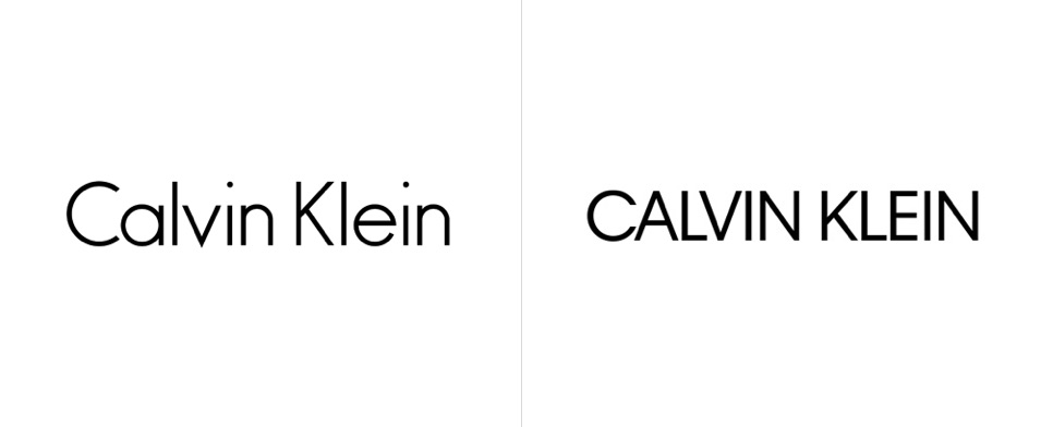
In a less controversial move, in 2017 Saville tweaked the Calvin Klein logo, making it entirely upper case. The change was subtle – so much so that the site Brand New remarked “why bother?”
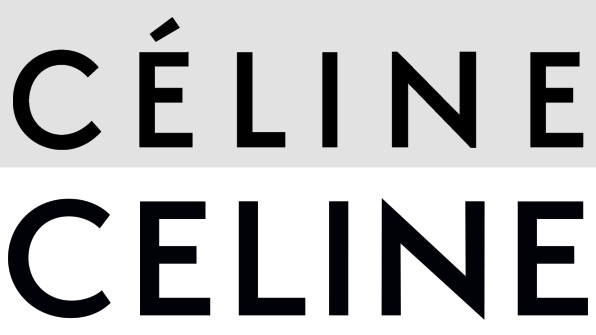
Similarly, in France, incoming designer Hedi Slimane changed the typeface of the Céline brand name, removing the accent over the E. The fashion house was quick to point out that this was merely a return to an earlier, 1930s incarnation of the brand name.
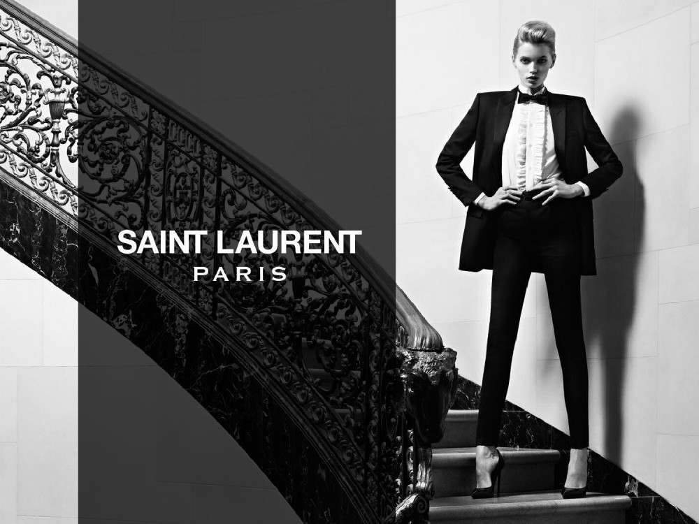
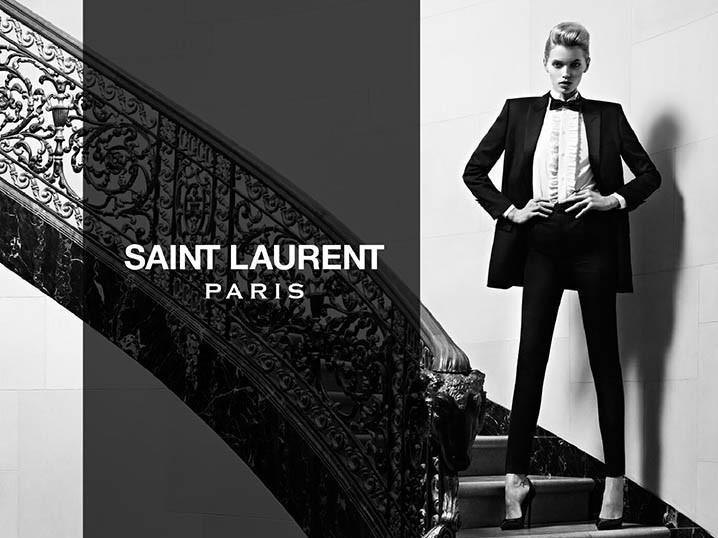
Slimane’s talent as a fashion designer notwithstanding (I’m of the view that his menswear designs for Céline – sorry, Celine – are wonderful), he has previous when it comes to tampering with brand identities. When he arrived at Yves Saint Laurent a few years ago, he changed its name to Saint Laurent Paris.
This may have been a nod to the fact that “Paris” is a brand name in itself, with all sorts of alluring romantic associations, but it was also somewhat tautological. Indeed, since his departure, I’ve noticed that Saint Laurent has discreetly dropped the “Paris” appendage.
Messing with logos strikes me as perilous, if not reckless. Building brands, and customer loyalty along with them, takes time, effort, and money. Trying to artificially refresh your brand’s appeal by altering its mark feels a lot like throwing the baby out with the bath water.



.jpg)
