News - Branding
Nokia goes through a major rebrand
by ArabAd's staff
February 26, 2023

For the first time in nearly 60 years, Nokia has changed its brand identity, as the telecom equipment maker focuses on aggressive growth.
"There was the association to smartphones and nowadays we are a business technology company," Chief Executive Pekka Lundmark told Reuters in an interview.
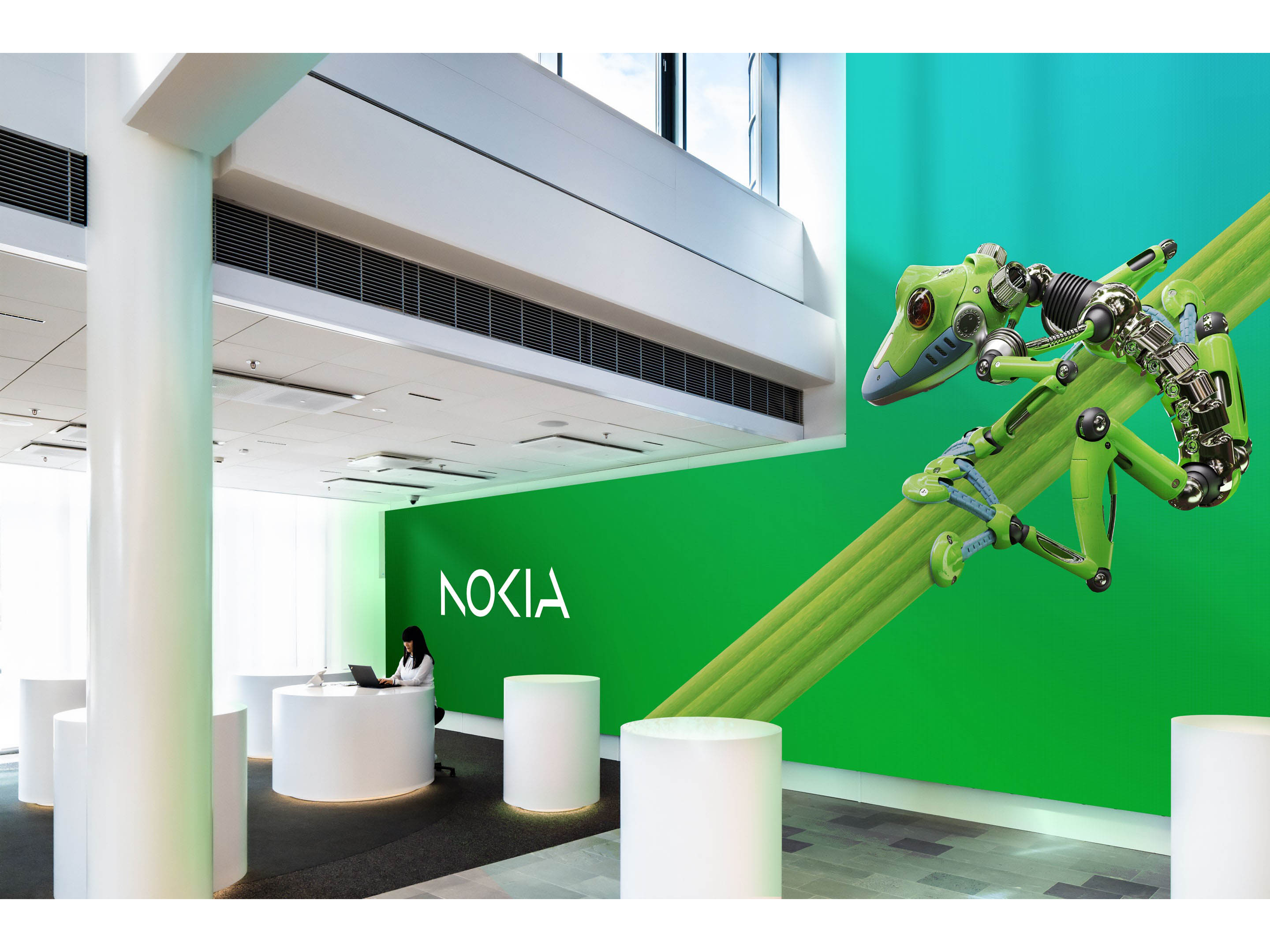
While the old logo was simple yet memorable, the new logo is slightly complex and comprises five different shapes forming the word NOKIA. The iconic blue color of the old logo has been dropped for a range of colours depending on the use.
“Our new logo is a bold evolution of the 1960s classic. It’s dynamic, precise and brings new meaning, cleverly representing our purpose with abstracted letters that, when acting together, read as Nokia,” explained Stacey Brierley Vice President, Brand, Nokia.
As a partner to Nokia through every major step in its brand journey for the past 15+ years, Lippincott, the global brand strategy and design company, hoped the redesign would clearly signal Nokia’s revised purpose as a company that is now a pioneering tech innovation leader. This meant simplifying the geometry of the original logo and striking the right degree of visual evolution so the iconic logo was still instantly recognizable.
Still connecting the new brand to Nokia’s history, the refreshed logo retains the original sharpness of the ‘K’. However, Lippincott’s work softens the logo’s once heavy industrial feel by reducing the weight of the original letters. The logo’s N, O and K letterforms have been repurposed as bold graphics to use across all content, so every communication from the brand is distinctively Nokia. Making use of lighter, more dynamic forms, the agency hopes the new logo has a more contemporary look to it, synonymous with high technology.
Lippincott also hoped to demonstrate Nokia’s belief in collaboration. Utilising an optical play, called apophenia, each individual letter was evolved into simpler digital forms where the human eye completes the invisible connections to spell out ‘Nokia’.
The new digital-first identity goes further with a kaleidoscopic color palette and bold imagery that cuts through the industry’s sea of sameness.
Nokia’s chief corporate affairs officer, Melissa Schoeb, says, “This is a bold step in Nokia’s journey – and will help us get recognised by existing and prospective customers for the B2B technology innovation leader we are today. This brand refresh marks a transformative moment in Nokia’s history. Now is our time to step forward confidently, with a brand that represents who we are today, and who we strive to become.”







.jpg)


