News - Branding
Gulf Air Introduces New Identity
by ArabAd staff
May 16, 2018

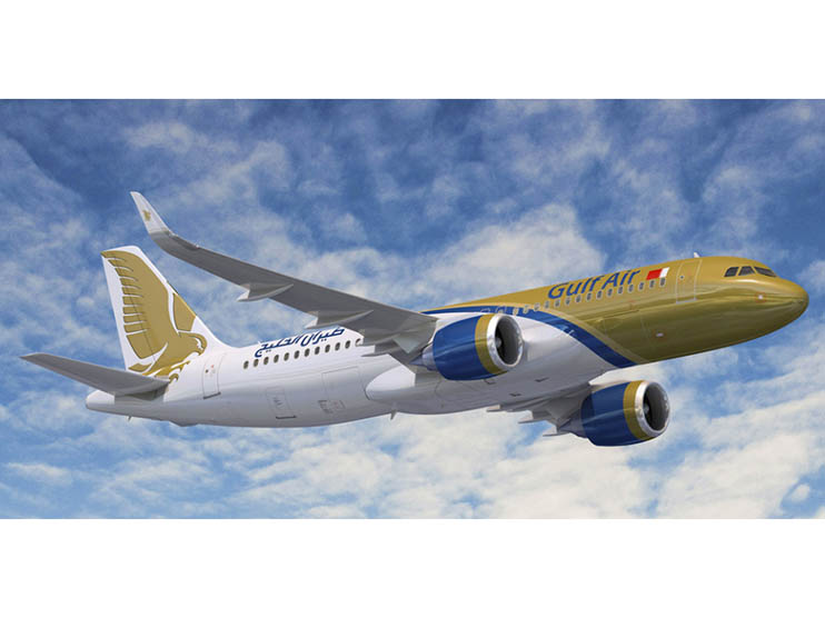
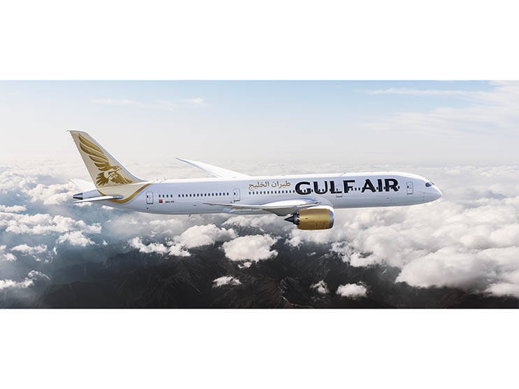
The new brand includes a new logo, identity system, new livery and a complete redesign of the aircraft interiors.
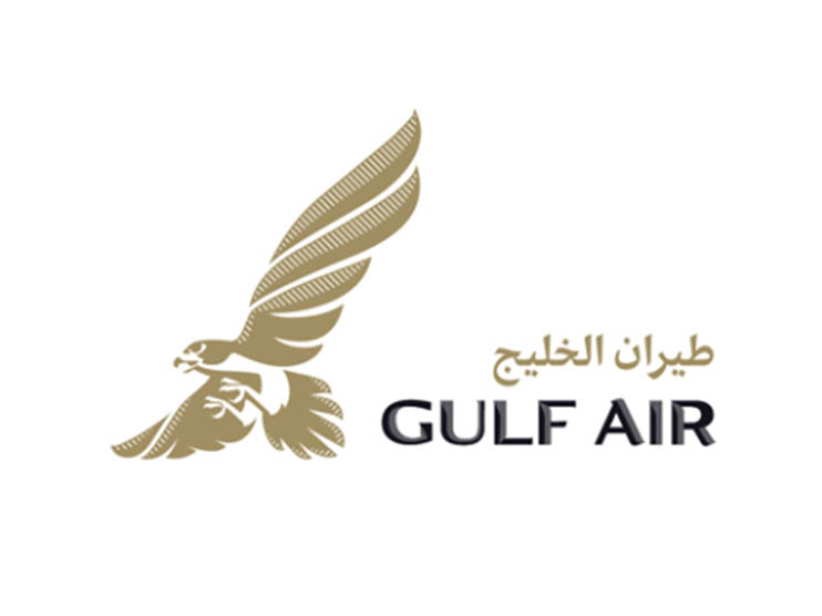
Gulf Air’s iconic falcon has accompanied the airline from its very beginnings and is rooted in the Middle East’s psyche. A symbol of courage, perseverance and freedom.
Illustrator Martijn Rivjen was commissioned to work on the logo. At the heart of the new visual language is Gulf Air Sans, a distinct typeface which echoes the shape of the falcons claws, beak and wings. To add depth and texture, shading which evokes finer details of the feather were incorporated The typeface is designed for Arabic and latin scripts and comes in three different weights, which was achieved using the experience of type foundry Letterjuice.
The iconography relates back to the curves and lines of the falcon logo. Each icon is itself a designed illustration.
The identity introduces an abstract pattern that can be used bold and colorful as in the stationery or more subtly as in the cards , all while giving the logo plenty of room and letting the falcon be the center of attention.
The identity has a nice range, where it can be more classy and stately through the use of gold, black, and white, but it can also turn more playful through colorful illustrations and bold photography, all while maintaining a connecting thread through the type family.
As the flag carrier of Bahrain, Gulf Air is a source of national pride and an ambassador to the Kingdom, the warmth and friendless of its people and trailblazing attitude were captured through the brand idea “smart with heart”, which guides every touchpoint of the Gulf Air experience.
The delicate balance of warmth and modernity is seen in the fleet’s new livery, which celebrates the airline’s impressive heritage.
Overall, this is a great update that gives Gulf Air a modern, elegant look that is more in line with the upscale notion of business and leisure travel to the Middle East.




.jpg)
